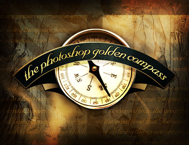
In this tutorial, we are going to create a sort of old-worldy composition featuring a compass and making use of some awesome vector artwork from Arsenal. As always there is a PSD file at the bottom of the tutorial. In this instance, I would highly recommend downloading it as this is quite a complex composition. Be warned this is a LONG tutorial!
Oh and in case you’re wondering, inspiration comes from a really neat set of books, one of which is called the Golden Compass (actually they are making the book series a movie now!).
AssetsOh and in case you’re wondering, inspiration comes from a really neat set of books, one of which is called the Golden Compass (actually they are making the book series a movie now!).
To do this, we’re going to need a few assets to work with. I’m using some vector shapes from GoMedia/Arsenal’s Freebie Section. Arsenal is a set of vector packs that you buy which can be used in Illustrator or Photoshop. In this instance because I’m cheap, I just went to the “Freebie” section and downloaded everything there!
Additionally I needed a compass image which I got from iStockPhoto for $1. I’m also using the Nuptial Script font. I can’t for the life of me remember where I got this font or if its free or not. In any case, if you haven’t got that specific font you can probably find something similar.
Additionally I needed a compass image which I got from iStockPhoto for $1. I’m also using the Nuptial Script font. I can’t for the life of me remember where I got this font or if its free or not. In any case, if you haven’t got that specific font you can probably find something similar.
Part 1 - the Banner
I’ve split this tutorial up into two sections, then at the end we bring them together to form the final image. You should download the PSD and take a look through it. This image is really pretty complicated and it will make more sense when you look at the layers!
Step 1:
So first of all, we start with a background gradient. As always I’m using a Radial Gradient, and taking some dark bluish colors.
Foreground color – #35444b
Background color – #1a2023
Foreground color – #35444b
Background color – #1a2023

Step 2:
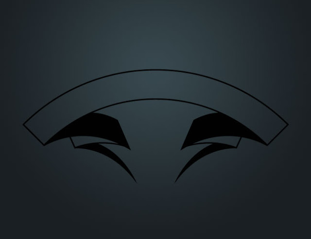
Now the next thing to do is paste in the first of our vector images. This is a sort of banner thing.
There are two ways you can do this. After you go to the GoMedia site, click on the Freebie section and you’ll download an EPS document. These documents are in a vector format and ideally you can open them in Illustrator then copy+paste the vector over to Photoshop. If you do it this way, you’ll get a Smart Vector Object which you can resize without losing any quality. If you do this, you may need to right-click the layer afterwards and click Rasterize Layer as we need to do some work on it.
Alternatively if you don’t have/use Illustrator, then just open the EPS file in Photoshop. It will ask you how what size you want to rasterize it at. I just choose some random values and then redo it a couple of times until I have the right size. Note that once it is rasterized, you will lose information in the image when you resize, so its best to only do it once.
Anyhow here’s the banner:
Step 3:
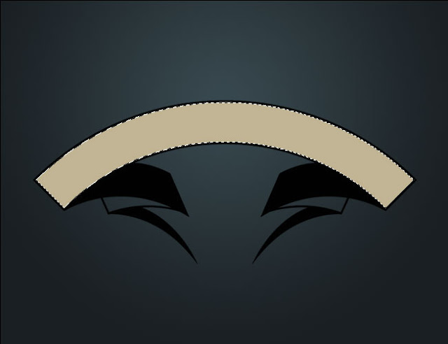
Now get the Magic Wand Selection Tool (W) and click on the top part of the banner, then create a new layer and fill it with a beige color (#dfd6b8)
Step 4:
Repeat the process with the two parts of the banner in the background (as shown below).
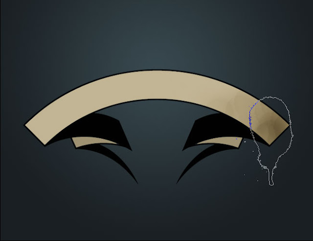
Next we want to roughen it up a bit, which we can do with the Burn Tool (O). In case you’ve never used the Dodge and Burn tools, basically they either darken or lighten an object. You use them by painting with a paintbrush and they are pretty neat tools. One handy tip is that once you have selected say the Burn Tool, then you can hold down Alt and it will switch to Dodge (and vice versa) so that you don’t need to go to the toolbar and change there.
Now because we want a really gritty look, it pays to use a gritty brush. In this instance, I’ve used a brush I again downloaded from the GoMedia site’s Freebie section. You just download them and then go open up the Brush palette, click on the little right-pointing arrow and choose Load Brushes and they should all appear at the bottom.
Once you have a nice grungy brush, just start burning the right hand side as shown. Do it in short blobs so you get a nice rough texture.
Step 5:
Repeat this process on the other side, then use a bit of Dodge in the middle. Then repeat again at the back, so that the bits towards the middle are darkened and the outsides are lightened.
Note that we are trying to simulate light here with the light source from dead ahead. So the reason we’re doing it like this is that the bits on either side should be dark because those parts are turning away from the viewer. At the back, the parts in the middle are falling into folds so they would be shadowed. Of course this is just a vague approximation, but it helps with the overall visual.
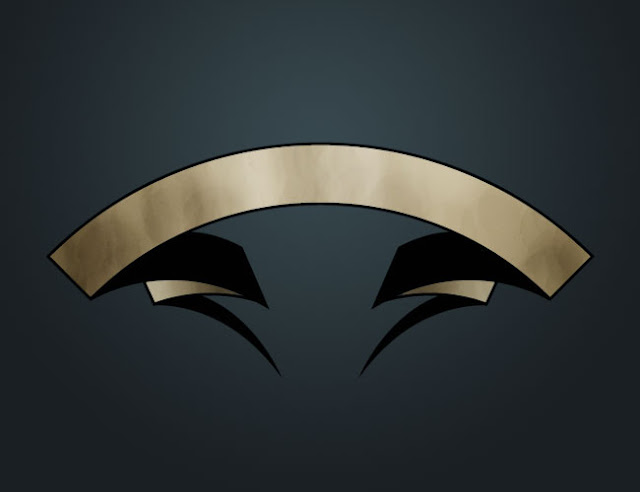
Step 6:
Now hold down Ctrl and click on the layer with the top beige part to select it. Then press the up arrow a few times. Then switch back to the original banner vector layer and press Delete.
Basically we are getting rid of the top black line.
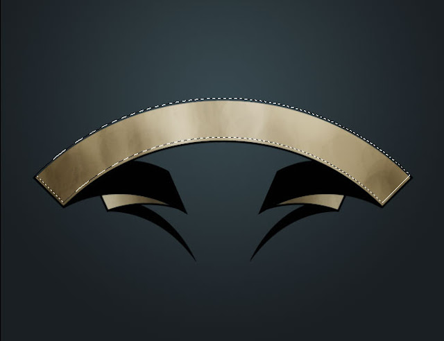
Step 7:
Now in a new layer, fill the selection with a dark blue (#283438)
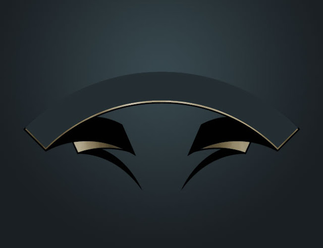
Step 8:
Get out the ol’ Burn Tool again and start to give this layer some texture. As before you want the edges to be slightly darker than the center, though don’t make the effect too pronounced.
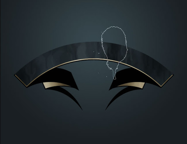
Step 9:
Now duplicate the beige layer from behind and move it up a little and then to the left as shown. This gives our banner an off-center kind of look which makes it superbad!
Step 10:
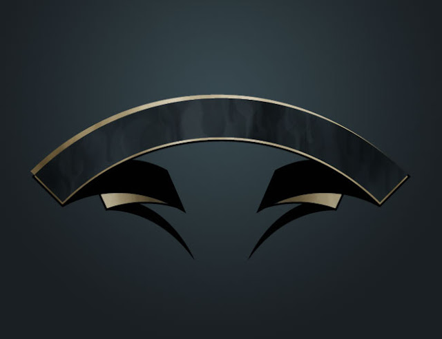
Next we’re going to replace the rest of the vector black part with dark blue and again give it some texture. So hold down Ctrl and click on that layer to select it. Then fill it with a dark blue.
Step 11:
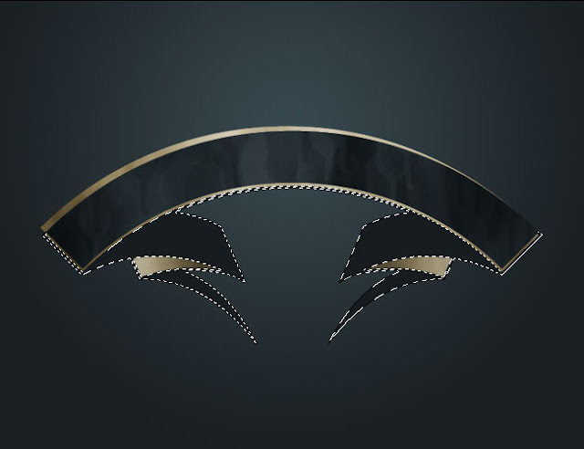
Now again go through and use the Burn Tool to add shadows to the parts that are going into the folds to give it a bit of three-dimensionality.
Step 12:
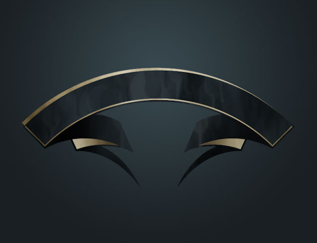
Next in a new layer write out some text. I wrote some random words here. Use a beige color and choose a nice font. In this case I’m using Nuptial Script.
Step 13:
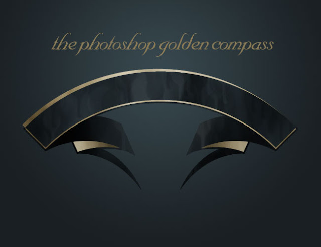
Now click on the Type Tool (T) and up the top click on that T with the arrow beneath it to bring up the Warp Text options. Here we’re using Arc and giving it a bend of about 43%.
Note that if you are an illustrator user you could do a Text on a Path thing in Illustrator and then copy it over and it might have less distortion on the letters. But since this is a Photoshop tutorial and not an Illustrator one, we’ll just stick to PSD
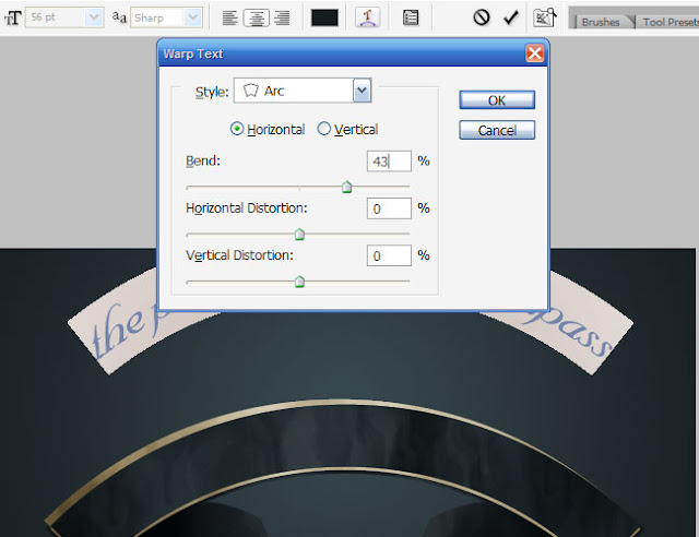
Step 14:
Next I’ve added some layer styles to make the text look kind of golden. You can open up the PSD at the end of this tutorial and just copy the layer style by right-clicking on the layer and choosing Copy Layer Style. I love layer styles as you will no doubt realize if you read enough of my tutorials. The best thing to do when using layer styles is play around with every setting, there are so many cool things you can do.
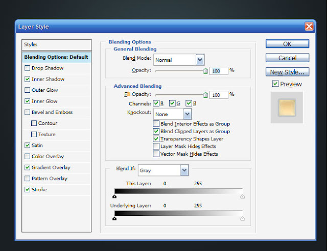
Step 15:
So you should have something that looks kind of like the image shown below! Next we’re going to make the background and coloring. So switch off these layers’ visibility and lets get started with the background.
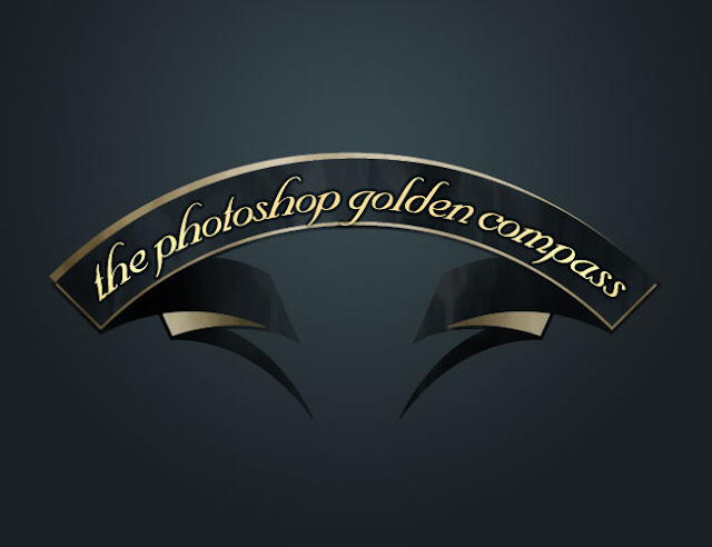
---------------------------------------------------------------------------------------------------------------------------------------------------------------
Part 2 - the Background
In this section, we’re going to make all the other parts of the image. These kind of go around what we’ve already done–the best way to see the order of the layers is to look at the Photoshop file.
Step 16:
So switch off all your current layers except for the background.

Step 17:
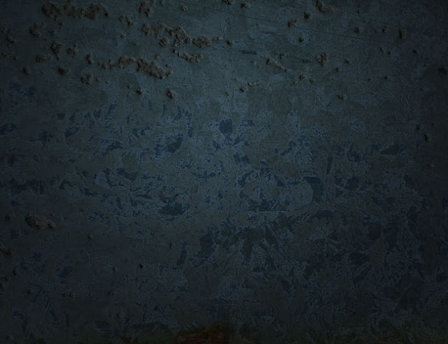
Now we’re going to add a bit of texture to the background. For this I’m using a sample texture, yet again from GoMedia/Arsenal’s Freebie Section
This one is called "Rust11.jpg." Paste it in and shrink it down to size. Then set it to Overlay so that it interacts with the dark blues from our background.
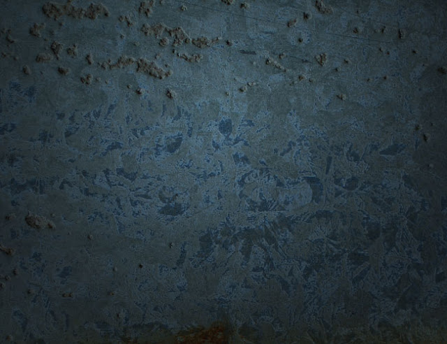
Step 18:
Because I didn’t think that looked dark enough, I added a layer on top of dark grey and set that to Multiply and 35%.
I should point out that with an image this complicated, you sort of have to experiment a lot and do things by eye. So often I would look at something and think, this needs to be darker, or that isn’t working and take things out or put things in. Certainly when coming up with this image I didn’t go through these steps in this order. Its just a convenient way to relay the information back to you. So don’t think that you need to have some amazing plan in mind when you’re making images, just do what feels right. The more you do, the more practiced your eye becomes at deciding whether something is right or not.
Step 19:
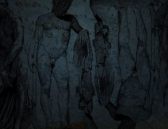
Now I’ve pasted in some more of the vectors from the GoMedia free pack. I chose some old-looking statue vectors and set them all to Multiply. Because I didn’t have enough, I flipped a couple over to cover the whole page without looking like I was just repeating over and over!
Step 20:
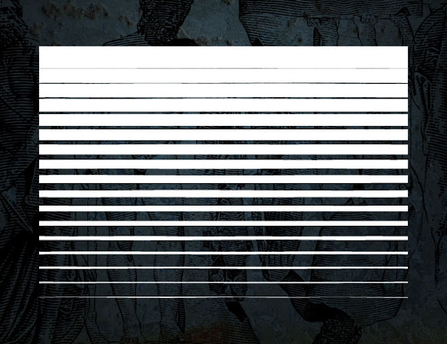
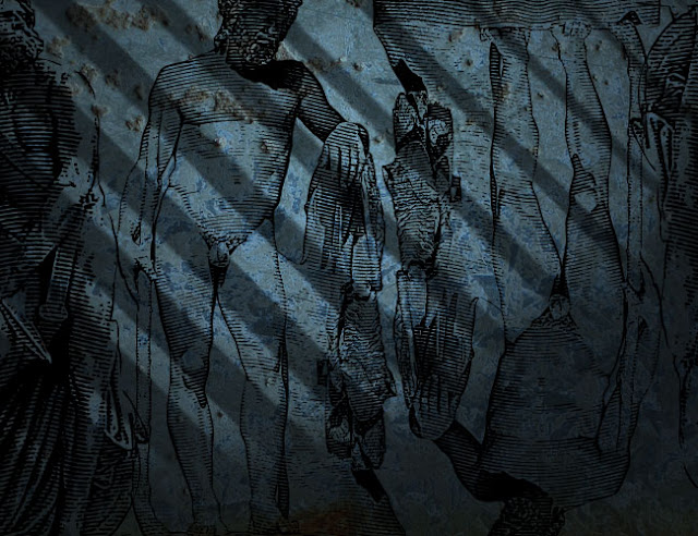
Next I paste in the second last of our vectors from GoMedia. This one apparently is a half-tone thing. In any case it looks like shutters to me and we’re going to use it for lighting. First because the vector was black, I pressed Ctrl-I to invert the color to white. You could just as easily Fill it with white, Color-Overlay it with white or select its pixels and make a new layer and fill that with white. Really there are often many ways to do the same thing in Photoshop: I guess that’s what makes it such a great program!
Step 21:
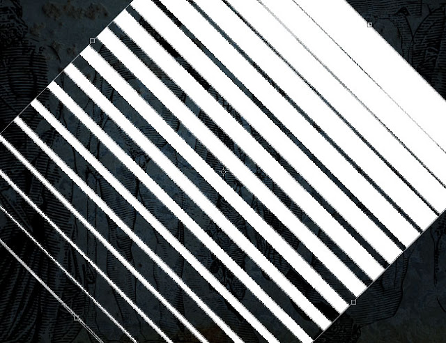
Next we hit Ctrl+T to transform and rotate the vector around and stretch it out to be bigger.
Step 22:
Set that layer to Overlay and make sure its nice and big (as shown below). As you can see, it looks kind of like light streaming in from some open shutters. You won’t be able to see much of this in the final image, but details like this add up to a nice complex composition in the end.
Also because light is rarely nice and sharp, its a good idea to go to Filters > Blur > Gaussian Blur and apply a blur with a radius of say 1px just to make it a bit fuzzy.
Step 23:
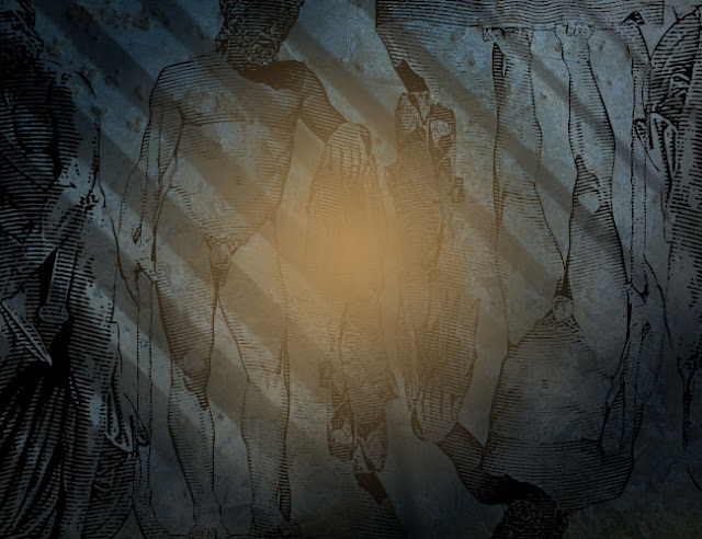
Next create a new layer and using a Radial Gradient going from beige (#b58d4e) to nothing, draw from the center out to make a patch of color as shown below. Set the blending mode of this layer to Screen. This is going to be another bit of lighting.
Step 24:
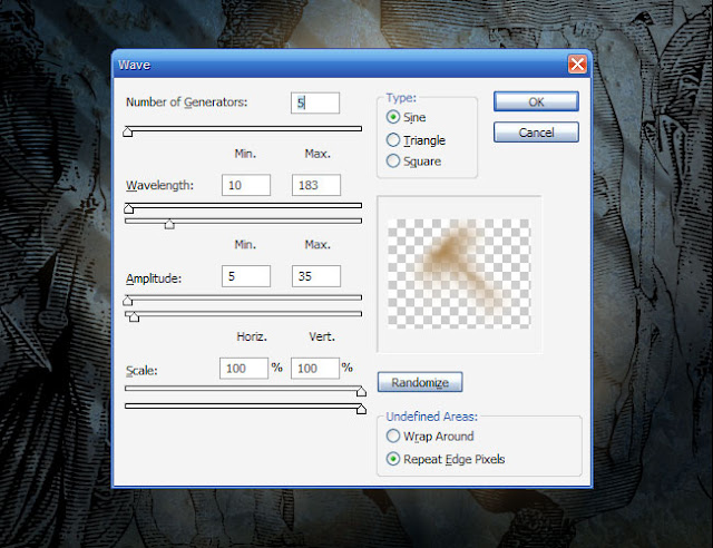
Now duplicate that last layer again and we’re now going to run a Wave filter over it a few times to make the lighting more dynamic. You do this by going to Filter > Distort > Wave.
I must admit I don’t really understand how the Wave filter works, so I usually just move some sliders around a bit and press Randomize until I get a nice distortion – scientific I know :-)
Anyhow once you have done that, you’ll see your blob becomes kind of wavy. Press Ctrl+F a few times to make it really distorted and you should get an interesting effect.
After you’ve done that, you could if you choose repeat the process and have a second light blob on the page.
Step 25:
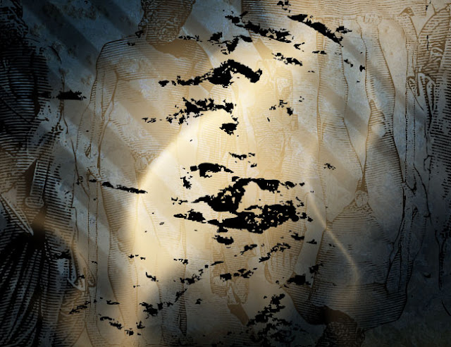
Now I’ve added yet another vector to the image, again from GoMedia’s free section. This just looks like some rough dirt, and I just added it and changed the blending mode to Overlay and 40%.
Step 26:
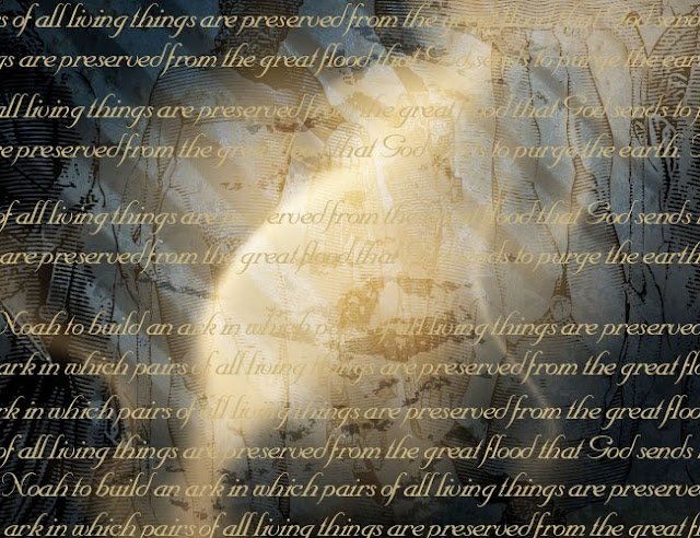
Next I went to some random Web page about the Bible and copied some random text and pasted it over and over. Actually looking back, I did a bit of a crappy job with keeping the lines even when I duplicated them, but that doesn’t really matter, I suppose. The main thing to do is get lots of text and merge the layers together.
Then set the blending mode to Hard Light and 40%.
Step 27:
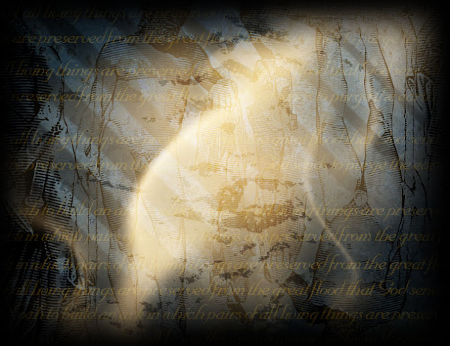
So far everything we’ve done should have been BEHIND the original layers from Part 1. Now create a layer ABOVE the Part 1 banner. And choose a big, fat, soft brush (say 200-300) and with black as your foreground color just paint around the edges as shown. When you’re done change the blending mode to Overlay.
Step 28:
Next in a new layer choose these colors as your foreground and background:
Foreground Color – deb883
Background Color – 745222
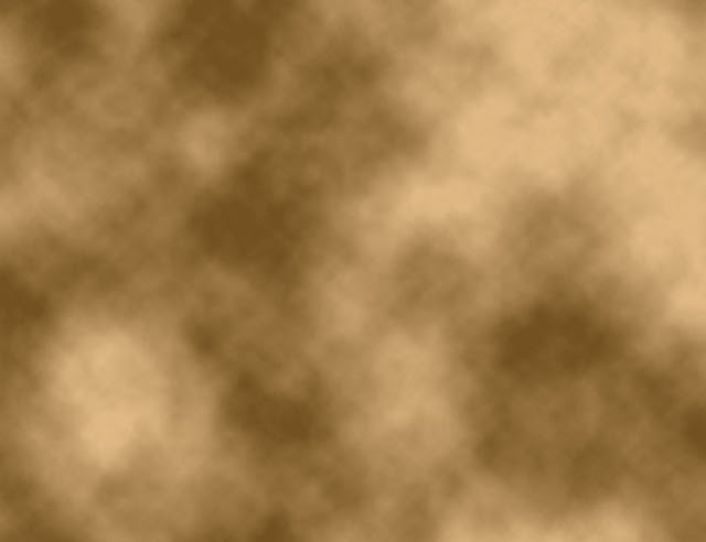
and then go to Filter > Render > Clouds. Now that should give you some clouds, but to get a more dynamic render, press Ctrl+Alt+F. I’m not sure what this actually is in the menus, but I know that it produces clouds with a heavier difference, which we want. You should get some clouds that look like those below.
Set the blending mode to Overlay and 65%. This layer is going to give us the majority of our coloring.
Step 29:
OK, almost there now!
You should have a few layers at the top, a bunch of background layers at the bottom, and then the layers from Part 1 somewhere in the middle.
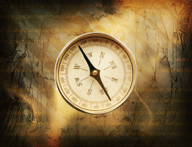
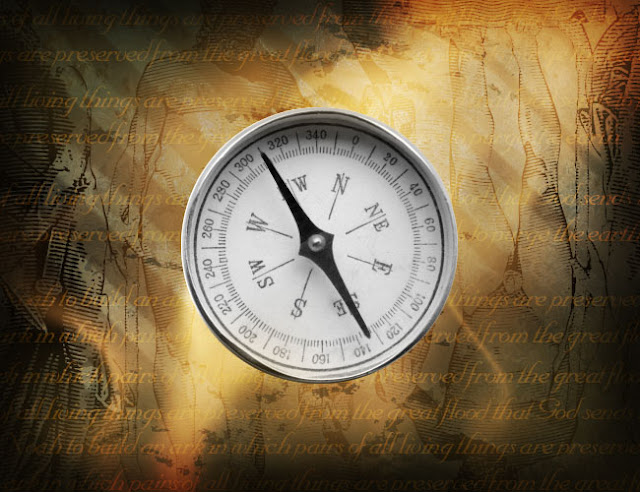
Next we’re going to add the compass in. This needs to go in the middle of the layers from Part 1 because it’s going to interact with them. You can see the exact order by downloading the PSD file from the bottom of this tutorial.
So using the Circle Selection Tool, I cut out the compass from its original background (remember I got this compass from iStockPhoto). It looks yellowish because we have that clouds layer somewhere above.
Step 30:
The compass looks a bit plain as it is, so we are going to soup up the colors a little. To do this, duplicate the compass layer and press Ctrl+Shift+U to desaturate it (i.e. make it Black and White)
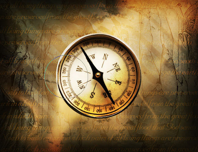
Step 31:
Set the Black and White layer to Overlay. This gives a higher contrast look. (Actually, you can achieve the same effect a few other ways.)
Next get out the Burn Tool again and, going to the original compass layer, give it some judicious burning down the bottom and sides. Now our compass is starting to look nice and warm.
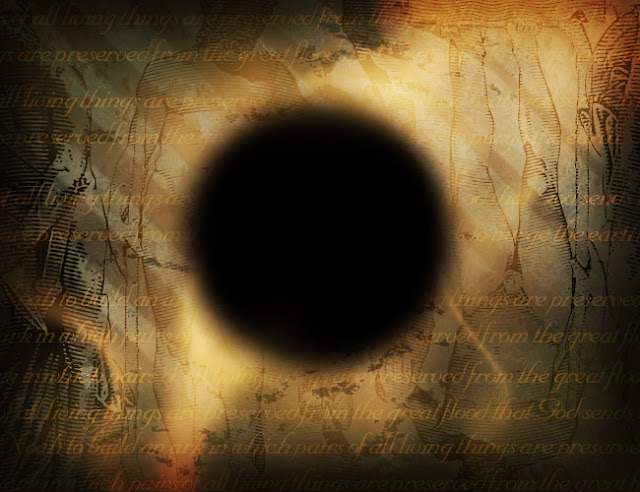
Step 32:
Then in a layer below the compass, make a black circle the same size as the compass. You can do this by pressing Ctrl and clicking on the compass layer then going back to the layer below and filling it with black.
Next go to Filter > Blur > Gaussian Blur and give it a blur of 10px or so. This is the shadow for our compass.
And Put It Together
Finally, we put the compass + background + banner together to form the final image!
Note that there were a couple of layers I left out to keep this tutorial short (well shorter anyway). You can download the PSD to see the rest! Hope you enjoyed that tutorial, it was a bit of a monster!

Next we want to roughen it up a bit, which we can do with the Burn Tool (O). In case you’ve never used the Dodge and Burn tools, basically they either darken or lighten an object. You use them by painting with a paintbrush and they are pretty neat tools. One handy tip is that once you have selected say the Burn Tool, then you can hold down Alt and it will switch to Dodge (and vice versa) so that you don’t need to go to the toolbar and change there.
Now because we want a really gritty look, it pays to use a gritty brush. In this instance, I’ve used a brush I again downloaded from the GoMedia site’s Freebie section. You just download them and then go open up the Brush palette, click on the little right-pointing arrow and choose Load Brushes and they should all appear at the bottom.
Once you have a nice grungy brush, just start burning the right hand side as shown. Do it in short blobs so you get a nice rough texture.

Step 5:
Repeat this process on the other side, then use a bit of Dodge in the middle. Then repeat again at the back, so that the bits towards the middle are darkened and the outsides are lightened.
Note that we are trying to simulate light here with the light source from dead ahead. So the reason we’re doing it like this is that the bits on either side should be dark because those parts are turning away from the viewer. At the back, the parts in the middle are falling into folds so they would be shadowed. Of course this is just a vague approximation, but it helps with the overall visual.

Step 6:
Now hold down Ctrl and click on the layer with the top beige part to select it. Then press the up arrow a few times. Then switch back to the original banner vector layer and press Delete.
Basically we are getting rid of the top black line.

Step 7:
Now in a new layer, fill the selection with a dark blue (#283438)

Step 8:
Get out the ol’ Burn Tool again and start to give this layer some texture. As before you want the edges to be slightly darker than the center, though don’t make the effect too pronounced.

Step 9:
Now duplicate the beige layer from behind and move it up a little and then to the left as shown. This gives our banner an off-center kind of look which makes it superbad!

Step 10:
Next we’re going to replace the rest of the vector black part with dark blue and again give it some texture. So hold down Ctrl and click on that layer to select it. Then fill it with a dark blue.

Step 11:
Now again go through and use the Burn Tool to add shadows to the parts that are going into the folds to give it a bit of three-dimensionality.

Step 12:
Next in a new layer write out some text. I wrote some random words here. Use a beige color and choose a nice font. In this case I’m using Nuptial Script.

Step 13:
Now click on the Type Tool (T) and up the top click on that T with the arrow beneath it to bring up the Warp Text options. Here we’re using Arc and giving it a bend of about 43%.
Note that if you are an illustrator user you could do a Text on a Path thing in Illustrator and then copy it over and it might have less distortion on the letters. But since this is a Photoshop tutorial and not an Illustrator one, we’ll just stick to PSD

Step 14:
Next I’ve added some layer styles to make the text look kind of golden. You can open up the PSD at the end of this tutorial and just copy the layer style by right-clicking on the layer and choosing Copy Layer Style. I love layer styles as you will no doubt realize if you read enough of my tutorials. The best thing to do when using layer styles is play around with every setting, there are so many cool things you can do.

Step 15:
So you should have something that looks kind of like the image shown below! Next we’re going to make the background and coloring. So switch off these layers’ visibility and lets get started with the background.

---------------------------------------------------------------------------------------------------------------------------------------------------------------
Part 2 - the Background
In this section, we’re going to make all the other parts of the image. These kind of go around what we’ve already done–the best way to see the order of the layers is to look at the Photoshop file.
Step 16:
So switch off all your current layers except for the background.

Step 17:
Now we’re going to add a bit of texture to the background. For this I’m using a sample texture, yet again from GoMedia/Arsenal’s Freebie Section
This one is called "Rust11.jpg." Paste it in and shrink it down to size. Then set it to Overlay so that it interacts with the dark blues from our background.

Step 18:
Because I didn’t think that looked dark enough, I added a layer on top of dark grey and set that to Multiply and 35%.
I should point out that with an image this complicated, you sort of have to experiment a lot and do things by eye. So often I would look at something and think, this needs to be darker, or that isn’t working and take things out or put things in. Certainly when coming up with this image I didn’t go through these steps in this order. Its just a convenient way to relay the information back to you. So don’t think that you need to have some amazing plan in mind when you’re making images, just do what feels right. The more you do, the more practiced your eye becomes at deciding whether something is right or not.

Step 19:
Now I’ve pasted in some more of the vectors from the GoMedia free pack. I chose some old-looking statue vectors and set them all to Multiply. Because I didn’t have enough, I flipped a couple over to cover the whole page without looking like I was just repeating over and over!

Step 20:
Next I paste in the second last of our vectors from GoMedia. This one apparently is a half-tone thing. In any case it looks like shutters to me and we’re going to use it for lighting. First because the vector was black, I pressed Ctrl-I to invert the color to white. You could just as easily Fill it with white, Color-Overlay it with white or select its pixels and make a new layer and fill that with white. Really there are often many ways to do the same thing in Photoshop: I guess that’s what makes it such a great program!

Step 21:
Next we hit Ctrl+T to transform and rotate the vector around and stretch it out to be bigger.

Step 22:
Set that layer to Overlay and make sure its nice and big (as shown below). As you can see, it looks kind of like light streaming in from some open shutters. You won’t be able to see much of this in the final image, but details like this add up to a nice complex composition in the end.
Also because light is rarely nice and sharp, its a good idea to go to Filters > Blur > Gaussian Blur and apply a blur with a radius of say 1px just to make it a bit fuzzy.

Step 23:
Next create a new layer and using a Radial Gradient going from beige (#b58d4e) to nothing, draw from the center out to make a patch of color as shown below. Set the blending mode of this layer to Screen. This is going to be another bit of lighting.

Step 24:
Now duplicate that last layer again and we’re now going to run a Wave filter over it a few times to make the lighting more dynamic. You do this by going to Filter > Distort > Wave.
I must admit I don’t really understand how the Wave filter works, so I usually just move some sliders around a bit and press Randomize until I get a nice distortion – scientific I know :-)
Anyhow once you have done that, you’ll see your blob becomes kind of wavy. Press Ctrl+F a few times to make it really distorted and you should get an interesting effect.
After you’ve done that, you could if you choose repeat the process and have a second light blob on the page.

Step 25:
Now I’ve added yet another vector to the image, again from GoMedia’s free section. This just looks like some rough dirt, and I just added it and changed the blending mode to Overlay and 40%.

Step 26:
Next I went to some random Web page about the Bible and copied some random text and pasted it over and over. Actually looking back, I did a bit of a crappy job with keeping the lines even when I duplicated them, but that doesn’t really matter, I suppose. The main thing to do is get lots of text and merge the layers together.
Then set the blending mode to Hard Light and 40%.

Step 27:
So far everything we’ve done should have been BEHIND the original layers from Part 1. Now create a layer ABOVE the Part 1 banner. And choose a big, fat, soft brush (say 200-300) and with black as your foreground color just paint around the edges as shown. When you’re done change the blending mode to Overlay.

Step 28:
Next in a new layer choose these colors as your foreground and background:
Foreground Color – deb883
Background Color – 745222
and then go to Filter > Render > Clouds. Now that should give you some clouds, but to get a more dynamic render, press Ctrl+Alt+F. I’m not sure what this actually is in the menus, but I know that it produces clouds with a heavier difference, which we want. You should get some clouds that look like those below.
Set the blending mode to Overlay and 65%. This layer is going to give us the majority of our coloring.

Step 29:
OK, almost there now!
You should have a few layers at the top, a bunch of background layers at the bottom, and then the layers from Part 1 somewhere in the middle.
Next we’re going to add the compass in. This needs to go in the middle of the layers from Part 1 because it’s going to interact with them. You can see the exact order by downloading the PSD file from the bottom of this tutorial.
So using the Circle Selection Tool, I cut out the compass from its original background (remember I got this compass from iStockPhoto). It looks yellowish because we have that clouds layer somewhere above.

Step 30:
The compass looks a bit plain as it is, so we are going to soup up the colors a little. To do this, duplicate the compass layer and press Ctrl+Shift+U to desaturate it (i.e. make it Black and White)

Step 31:
Set the Black and White layer to Overlay. This gives a higher contrast look. (Actually, you can achieve the same effect a few other ways.)
Next get out the Burn Tool again and, going to the original compass layer, give it some judicious burning down the bottom and sides. Now our compass is starting to look nice and warm.

Step 32:
Then in a layer below the compass, make a black circle the same size as the compass. You can do this by pressing Ctrl and clicking on the compass layer then going back to the layer below and filling it with black.
Next go to Filter > Blur > Gaussian Blur and give it a blur of 10px or so. This is the shadow for our compass.

And Put It Together
Finally, we put the compass + background + banner together to form the final image!
Note that there were a couple of layers I left out to keep this tutorial short (well shorter anyway). You can download the PSD to see the rest! Hope you enjoyed that tutorial, it was a bit of a monster!


0 Comments