

Step 1
Firstly we’re going to make a nice background. Start by creating a new document in Photoshop, all the default settings except dimensions: 600 pixels width, 300 pixels height.

After making your new document, fill the background layer with black then make a light gradient in a new layer.

Now you’ve got two layers, the background layer and your gradient layer, change the opacity for your gradient layer to about 5-15%, so that you end up with a very dark background again.

Now, you can finish off the background by adding in a screenshot of the Bee movie or like that.

Copy the image you’ve chosen to your document and resize it to fit. After this, change the layer opacity to around 15-25%, duplicate your screenshot layer and change the layer mode to either Overlay or Soft Light.

Now you should have a background like this.
Lastly for your background, create a new layer and draw a black to white linear gradient on your canvas, black at the bottom and white at the top, similar to this:

Change the layer mode for your gradient layer to Multiply and you’ll end up with an effect like this:

What do you think? Well, at least we’re done for the background!
Step 2
Alright, time to make our base text. What you need here is a very,very fat font. Head over to DaFont or UrbanFonts and see if you can find a nice, large sans-serif font.

In the above image I’ve used a font called Frutiger 95, which is sadly a commercial font. Feel free to try a different font such as Arial Black, or you know, buy or ‘get’ a nice font from somewhere. ;)
Note: Since we’re working in a fairly large document size, you will want to use a large text size, around 150 pt or whatever suites the document size.
Step 3
Now, to make our text look like the real thing, we’ll add some layer styles.
- Drop Shadow
- Inner Shadow
- Inner Glow
- Bevel and Emboss
- Bevel and Emboss — Contour
- Gradient Overlay


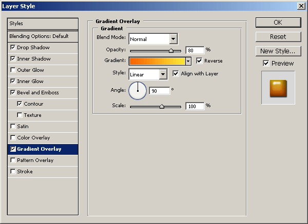
Colors used were:
- Inner Glow: #7f7f51.
- Gradient Overlay: #f86503 and #fbe432.
And now we have something like this:

Looks pretty much finished already, huh?
Please note: The layer styles depend on what size your text is, the size of the bevel may need to be adjusted for smaller or bigger text, please remember this.
Step 4
The last thing we really need to do is add ‘Movie’ underneath the main text, but in a smaller font size. You can simply duplicate your main text here, size it down and change the letters, but the layer styles will actually need a little tweaking.
After duplicating your main text and changing what needs to be changed, position your text accordingly, like mine:

Now, apply/edit the following layer styles/settings:
- Drop Shadow
- Inner Shadow
- Inner Glow
- Bevel and Emboss
- Bevel and Emboss — Contour
- Gradient Overlay


Alright, now, hopefully your text looks something like this:

-------------------------- tutsplus


0 Comments